I've been using the adobe photoshop channel mixer and love it to death.
If you want to feel like your back in kindergarten, just play with any imaging software.
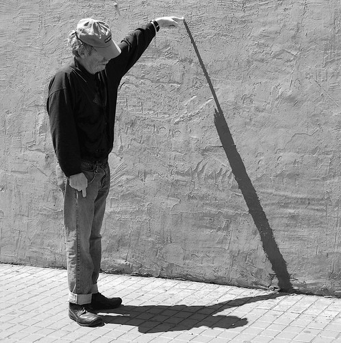
An ipernity member, named Pappion, again suggested making the photo b&w and deepening the shadow on the wall.
So ... I did just that and voila!
A Shadow of the Man He Is: Redux, 2009
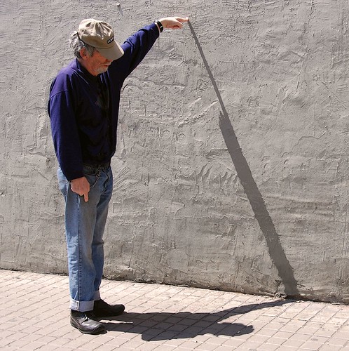
This is how the photo originally looked below.
A Shadow of the Man He Is, 2008
See any difference?
When you really think about it, the photo and the story is of a shadow and shadows as the eye see it has no color. No?
Anyway, the story was originally posted and I think you might like it so you can click HERE.
I think you really don't want to miss creative writing at its worst.
Enjoy!


I like the monochrome version better, Luna. Somehow it feels stonger visually.
ReplyDeleteEki
ReplyDeleteFirst .. it's been a long time and I was very happy to see your post.
Thanks so much for your input on the photo.
I also think the b&w is better.
Regards,
Luna